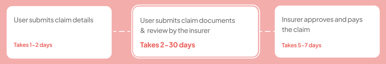
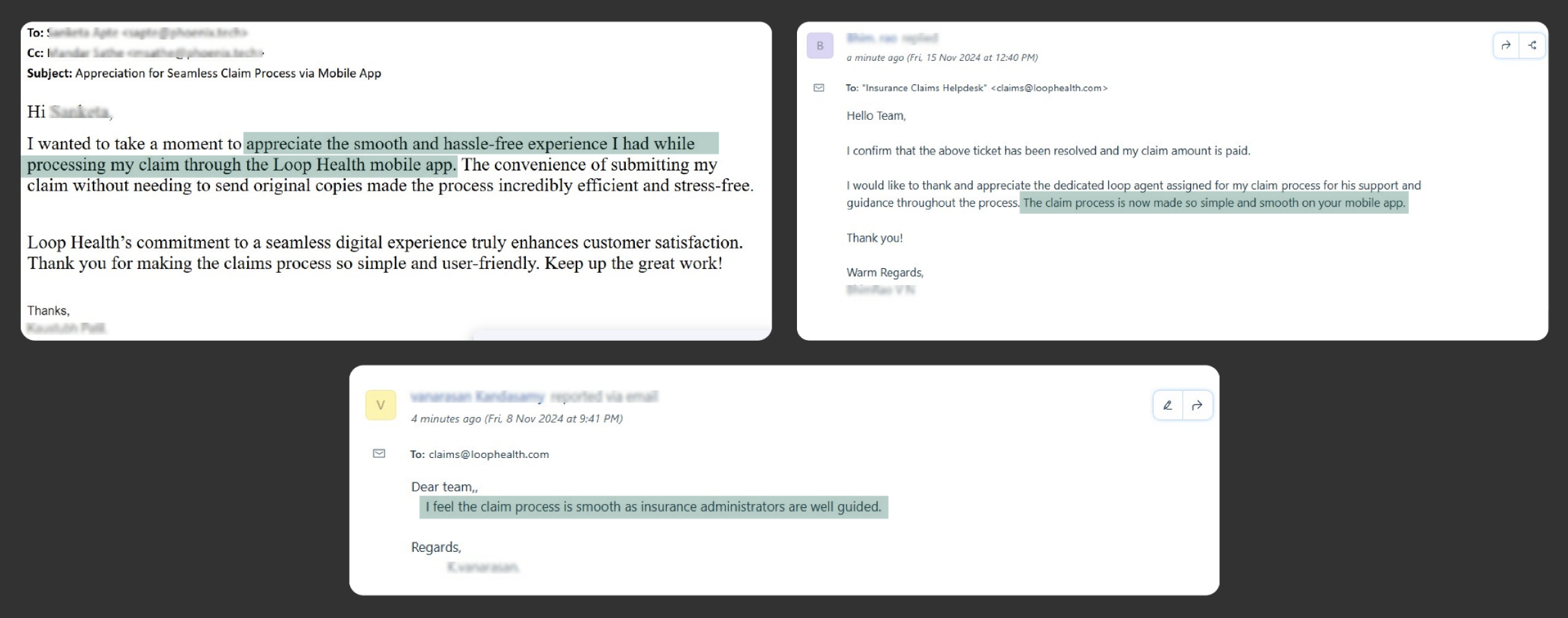
Claiming with Loop
“It’s been 20 days since I claimed, I still don’t have my money!
Every time I call - you ask me for new documents, can’t you tell me everything at once?”
~ Vipul, a loop customer
Top Insights
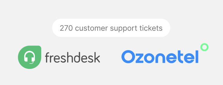
Upon analysing 270 customer support tickets we realised -
- 90% claims had issues with documents for which insurers raised queries. The top documents for which queries were raised were -
- Bank document - 35%
- Indoor case papers - 21%
- Attestation not done on documents - 15%
- USG Lab reports - 15%
- 40% cases were delays by the insurer


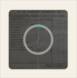
270 customer support tickets
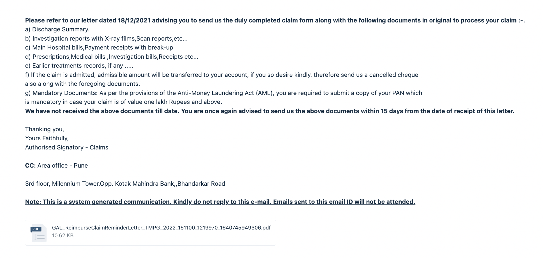
ref : email sent to user asking for claim documents
The quick solve
Since this was a burning problem, we came up with a quick solve -
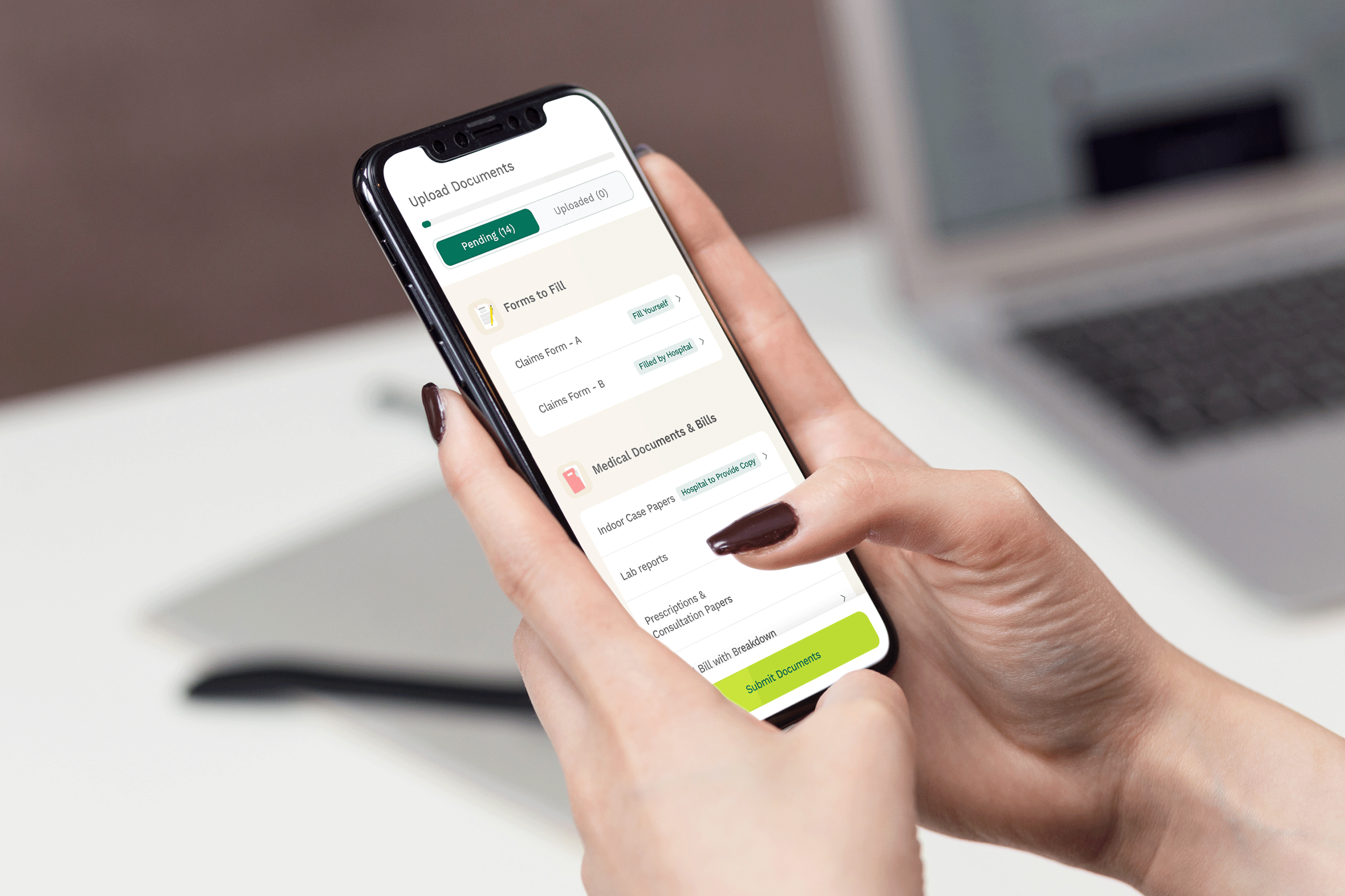
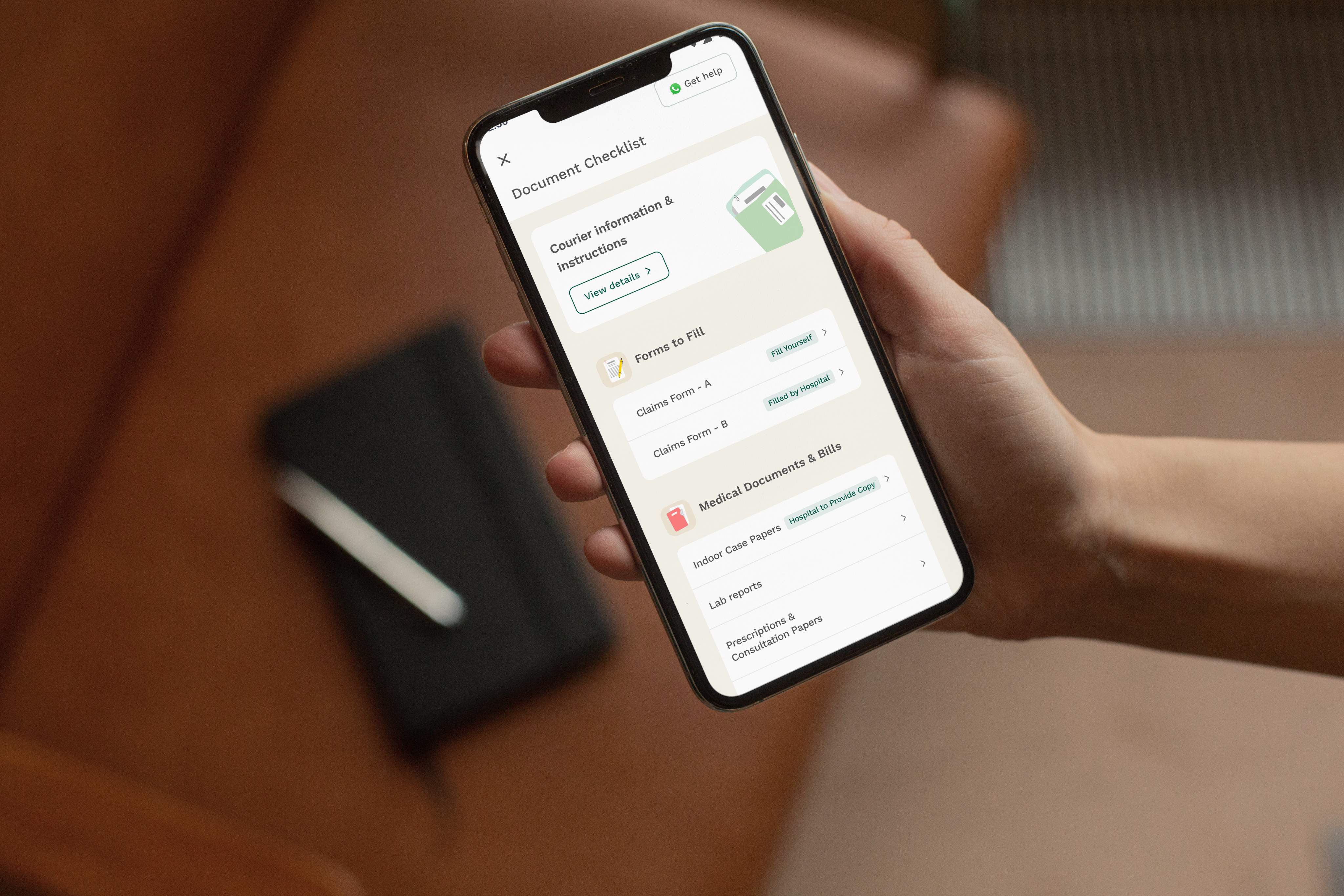
We created an interactive document checklist that includes:
- Mandatory documents
- Additional documents based on your treatment
- Samples and guidelines for each document
From the hospital visit
Your Documents
Case Specific Documents (if applicable)
All the documents listed are mandatory
These documents are mandatory only if you fall under any case below
Missing any of your documents could lead to a deduction or denial of your claim
Document List


For any queries, call at 080-3783-6789
Click on the category to view the documents required
- Copy of PAN Card of Employee
- Cancelled Cheque of Employee with Printed Name
OR
Bank statement/ Photocopy of first page of passbook
- Copy of Aadhar Card (Both Patient and Employee)
OR
Birth Certificate (in case of a baby)
- Claims Form (Part A)
OR
Summary of Expenses (if mentioned in email)
- Prescriptions
- Lab Reports
- Paid Receipts matching Final Bill Amount
- Pharmacy Bills
- Hospital Bill with Breakups
- Indoor Case Papers (with Doctor’s Notes, TPR Chart & Nursing Sheet)
- Discharge Summary OR Daycare Summary OR Death Summary
- Claims Form (Part B)
OR
. Summary of Expenses (if mentioned in email)
Death Case
Chemotherapy/Radiotherapy
Angioplasty
Angiography
Hernia
Abortion
Accident
Orthopaedic case
Cataract
Surgery
Maternity
Viral Infections/ Fever/ Malaria/ Dengue/ Typhoid etc
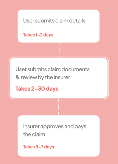
But, was it working?
No, because -
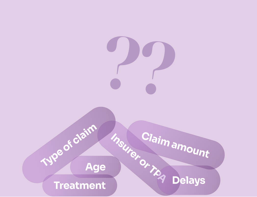
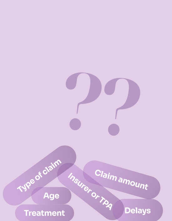
- Document requirements varied based on 7 factors (e.g., insurer, treatment, claim type), making it complex.
- The PDF guide was over 100+ pages and not tailored to the user's case—making navigation difficult.
- Tracking pending documents was difficult—users have to submit 14-16 documents (avg)
CONCEPT A - The guided tour
Documents were grouped into categories to reduce overwhelm by showing only one group at a time and guiding users step by step.
What did users think of it?
- Users liked the clean and minimal UI, but wanted to know upfront which documents are needed
“It says 3 documents — but what are those 3 documents?”
- Tracking documents with the counters was difficult
“The tag says 1/2 have been uploaded, I wouldn’t know which one is done and what’s remaining.”
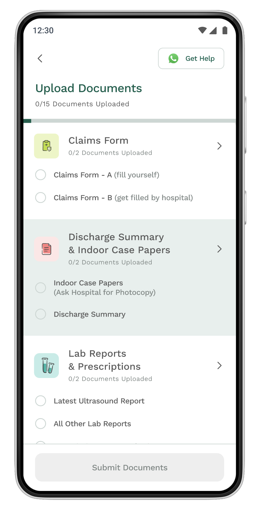
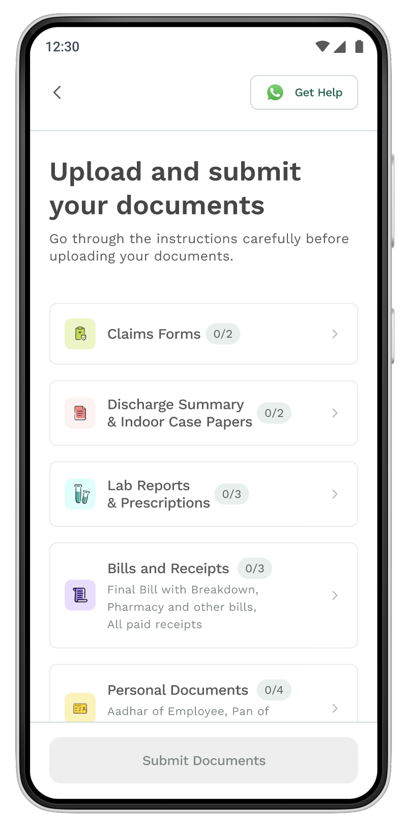
CONCEPT B - The checklist
This approach worked like a to-do list. All required documents were visible upfront within each category, and items got checked off automatically as users submitted them.
What did users think of it?
- Liked seeing all documents upfront
“I can see everything in one go. I don’t have to double click.”
- Found tracking easier with checkmarks and progress bar
“The bar gives me an overview, the ticks give me detail.”
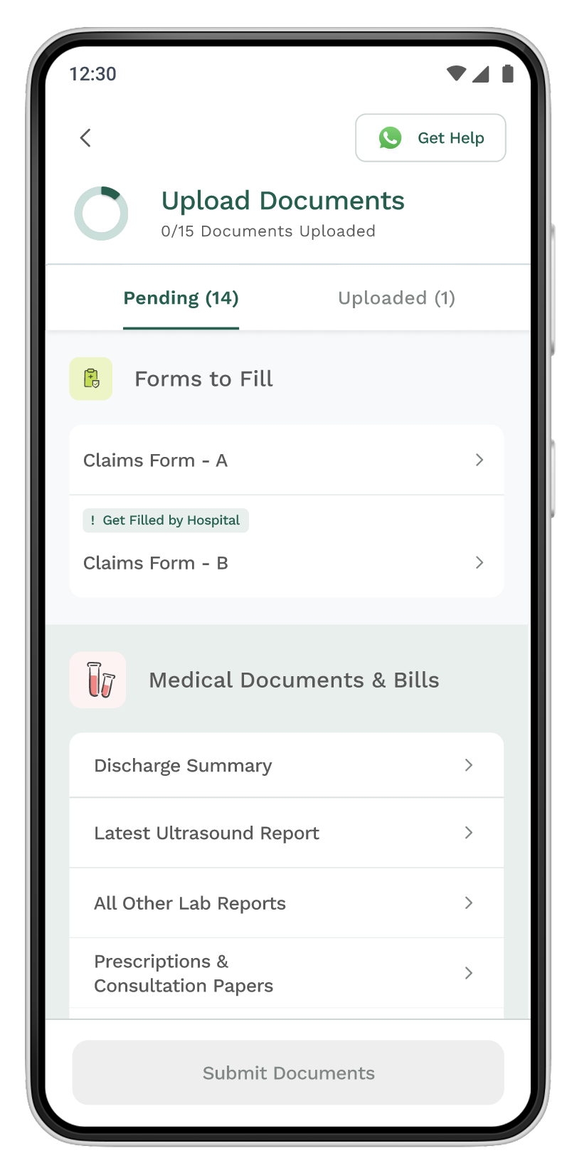
CONCEPT C - Clear as you go
This design helped users stay focused by showing only what’s pending.As soon as a document was uploaded, it automatically moved out of the list.
What did users think of it?
- Liked seeing all required documents upfront
“I can see everything in one go. I don’t have to double click.”
- Found tracking easier with both bar and checkmarks
“Bar gives me an overview, the ticks give me detail.”
Challenge overcome: Stakeholders favored Concept A for its “clean” look and weren’t sold on Concept C. It took strong articulation and user testing to shift their view — once they saw real user quotes, their confidence grew. A hard-won battle! 🔥
The visual design
With Concept C locked in, I moved into visual design—translating the flow into high-fidelity screens. The goal was to make a dense, information-heavy interface feel light, approachable, and friendly.
Color
To make the experience feel calm and non-clinical, I introduced a warm beige tone as the background. This not only improved contrast for better readability but also reduced eye strain, especially on long forms. This color was later adopted across different features and products.
Surface colors
Surface/2
#F7F4EB
Surface/1
#FFFFFF
Surface/0
#F8F9FA
Surface/Fill Grey
#595959
Surface/Fill Emerald
#025F4C
Surface/Fill Green
#BCDD33
Surface/Fill Red
#FF8080
NEW
NEW
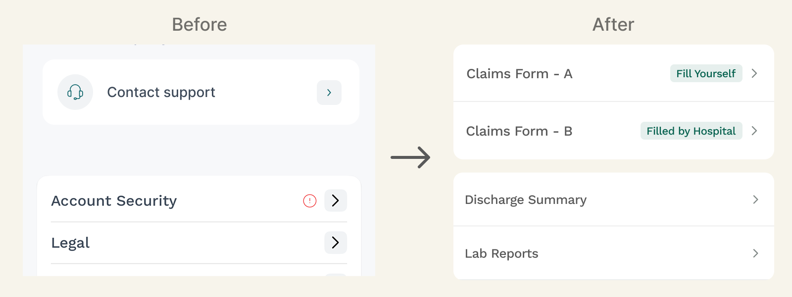
List Component
Given the number of documents users had to manage, the list component was designed to reduce cognitive load.
Documents were grouped under clear categories with contextual tags, making it easy to scan and act.
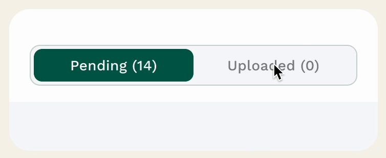
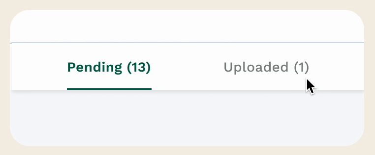
Tabs
The earlier tab design lacked visual clarity—users often missed which tab was active.
I redesigned it with stronger contrast, pill-shaped buttons, and clearer boundaries to improve visibility and clickability.
Before
After
Bottom sheets
To keep the main screen clean and focused, we added bottom sheets to show detailed help only when needed—reducing clutter without losing clarity.
Upload Documents
Title comes here..
Lorem ipsum dolor sit amet, consectetur adipiscing elit,
Button

CTA
Some other components added to the library
To improve clarity and feedback, I introduced a few key UI elements: a progress bar to give users a quick sense of how many documents were left, an inline image loader to show real-time upload status, and a larger font size (Semibold 26) for document titles to make important information easier to scan.

Progress bar
Image loader
Font Type